 ultimate-guide
Best Paper Types for Fine Art Prints: 2026 Guide
Table of Contents
- Understanding Fine Art Paper vs Photo Paper
- Surface Finishes Explained: Matte vs Glossy Art Prints
- Paper Weight and Texture for Fine Art Prints
- Best Paper for Digital Art Prints: Selection Framework
- Acid-Free and Archival Properties: Print Longevity
- Comparison Table: Best Paper Types for Fine Art Prints
- Common Mistakes in Paper Selection and How to Avoid Them
- Care, Display, and Storage for Long-Term Print Quality
- Frequently Asked Questions
Last Updated: October 19, 2026
Understanding Fine Art Paper vs Photo Paper
Fine art paper is built for archival longevity and artistic expression, using cotton rag or textured watercolor substrates, acid-free construction, and heavyweight formulations that resist yellowing and fading for decades. Photo paper prioritizes color saturation and immediate impact with glossy or semi-glossy coatings optimized for ink absorption.
For gallery display, collection, or long-term preservation, fine art paper is the foundation. For promotional materials, event photography, or shorter display periods, photo paper delivers faster, more vivid results.
Archival quality and longevity differences
Archival quality is a paper's ability to resist deterioration. Archival fine art papers are acid-free, pH-neutral, and lignin-free, preventing the chemical breakdown that causes yellowing, brittleness, and color shift.
Photo papers vary widely: premium options may offer archival certification lasting 100+ years under proper storage, while budget papers may degrade visibly within 5-10 years under light and humidity fluctuations.
For Twin Pines Media's customers who value unique, handcrafted wall art, archival quality matters: a print that fades within a few years undermines the artwork's perceived value, and archival cotton rag and textured watercolor papers protect that investment.
Ink absorption and color reproduction
Ink absorption determines how pigment or dye sits on the surface. Fine art papers' porous, fibrous structure absorbs ink gradually, letting pigments settle in for softer color transitions and reduced gloss.
Photo papers use coated surfaces that hold ink on top of the substrate, delivering higher color saturation, sharper detail, and greater black density while controlling ink spread.
Color accuracy depends on paper and printer setup.
Surface Finishes Explained: Matte vs Glossy Art Prints
Surface finish is the most visible distinction between papers, affecting light reflection, color intensity, viewing angle, and mood.
Matte and deep matte finishes
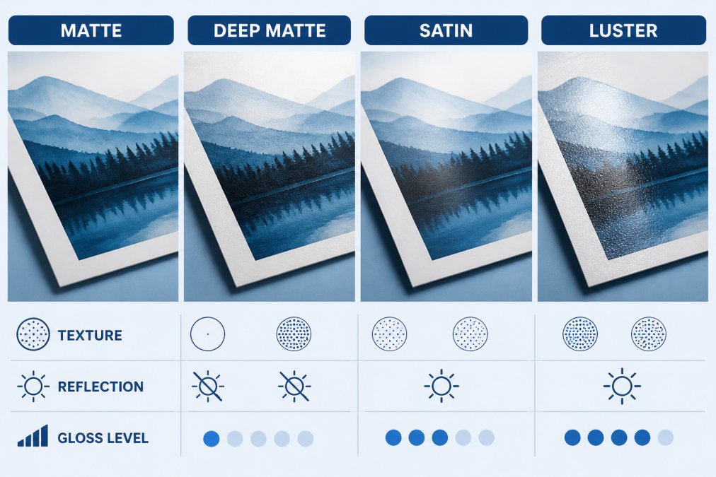
Matte finishes scatter light diffusely, eliminating gloss and reflection for a soft, contemplative look ideal for fine art, emotionally deep photography, and bright environments where glare would distract.
Deep matte finishes add heavier texture and ink absorption for an almost velvety appearance, popular for fine art prints, especially landscape and wildlife photography where reduced reflections aid immersive viewing.
The trade-off: matte finishes slightly reduce color saturation versus glossy. A vibrant red appears muted on matte, which suits moody, atmospheric pieces but is a loss for others.
Glossy, satin, and luster finishes
Glossy finishes reflect light directly back to the viewer, creating vivid saturation, high contrast, sharp detail, and greater black density. They suit product photography, saturated landscapes, and high-impact prints.
Satin finishes offer more saturation than matte with less glare than full glossy, while luster finishes provide similar balance with a subtle, sophisticated sheen.
Viewing angle matters: glossy and luster prints shift color depending on your position relative to the light source, while matte prints appear consistent from any angle, making them preferable for gallery settings.
Choosing finish by artwork type and display conditions
Landscape and nature photography typically benefits from matte or deep matte finishes, which reduce glare and enhance contemplative quality.
Display conditions matter equally: brightly lit environments, galleries with spotlights, and homes with large windows favor matte finishes to eliminate glare, while controlled lighting supports glossy finishes without overwhelming viewers.
For Twin Pines Media customers, the finish should align with how the work will be displayed: a sun-soaked living room wall requires different considerations than a dim bedroom corner.
Paper Weight and Texture for Fine Art Prints
Paper weight and texture affect handling, durability, and visual appeal, so understanding these measurements helps you select the best paper types for fine art prints that perform reliably.
Paper weight is measured in grams per square meter (gsm).
Fine art papers often range from 250 to 400 gsm, providing body without excessive rigidity. Cotton rag at 310 gsm feels luxurious; watercolor papers at 350+ gsm support multiple layers of ink or media.
Texture describes the surface pattern.
Understanding gsm and heavyweight paper
Heavyweight paper (300+ gsm) resists buckling when wet from ink or humidity, feels more substantial in hand, and is less prone to damage during framing or handling. For prints destined for sale or collection, heavyweight paper is standard.
Most fine art papers sold for serious printing fall between 280 and 400 gsm. Below 280 gsm, paper begins to feel thin and fragile.
Cotton rag and textured watercolor papers
Cotton rag papers are made from cotton fiber rather than wood pulp, creating superior archival properties, enhanced ink absorption, and a distinctive texture.
Watercolor papers, traditionally used for painting, have gained popularity for fine art printing. These papers feature pronounced texture, cold-pressed for moderate texture, rough for dramatic surface variation.
Both cotton rag and watercolor papers work best with pigment inks rather than dye inks.
Best Paper for Digital Art Prints: Selection Framework
Choosing the best paper requires matching three variables: your artwork's characteristics, your printer's capabilities, and your desired outcome.
Start by assessing your artwork. Photographs generally suit glossy or satin finishes for color accuracy.
Next, evaluate your printer. Desktop inkjet printers handle papers up to roughly 300 gsm reliably. Larger format printers (24" and wider) support heavier papers and specialty substrates.
Matching paper to artwork style and subject
Saturated images, vibrant landscapes, colorful abstracts, and high-contrast black-and-white work demand glossy or luster finishes, which maximize color gamut and black density for richer color and sharper contrast.
Subtle, atmospheric work, soft landscapes, muted tones, fine detail, suits matte finishes. Matte reduces glare and allows viewers to focus on nuance rather than surface shine.
Limited editions and gallery-quality prints almost always use cotton rag or heavyweight fine art papers. These signal quality and permanence.
Printer, ink, and ICC profile compatibility
Your printer's ink system determines which papers work best. Pigment inks (used in professional and high-end consumer printers) work with any paper type.
ICC profiles are essential. These color-management files tell your printer how to render colors on a specific paper.
Before committing to large quantities of paper, print a test sheet. Evaluate color accuracy, detail sharpness, and overall appearance.
Acid-Free and Archival Properties: Print Longevity
Acid-free and pH-neutral papers resist the chemical breakdown that causes yellowing, brittleness, and color shift. These properties define archival quality.
Acid-free means the paper contains no free acids that would degrade fibers over time. pH-neutral means its chemical composition sits at pH 7 rather than acidic or alkaline.
Fine art papers marketed as archival typically meet standards set by organizations that test paper longevity.
Photo papers vary. Premium options may offer archival certification.
For customers selecting prints through Twin Pines Media, archival quality justifies the price difference.
Comparison Table: Best Paper Types for Fine Art Prints
| Paper Type | Surface Finish | Weight Range | Best For | Archival Rating |
|---|---|---|---|---|
| Cotton Rag | Matte, Satin | 310-400 gsm | Fine art, photography, limited editions | Excellent (100+ years) |
| Watercolor (Cold-Pressed) | Textured Matte | 300-400 gsm | Paintings, illustrations, fine detail | Excellent (100+ years) |
| Watercolor (Rough) | Textured Matte | 350-400 gsm | Dramatic texture, artistic expression | Excellent (100+ years) |
| Fine Art Glossy | Glossy | 250-300 gsm | Vibrant color, high contrast | Very Good (50-75 years) |
| Premium Photo Paper | Glossy, Satin, Luster | 250-300 gsm | Photography, proofing, commercial use | Good (25-50 years) |
| Budget Photo Paper | Glossy | 200-250 gsm | Temporary display, proofing | Fair (5-10 years) |
Common Mistakes in Paper Selection and How to Avoid Them
Most paper selection mistakes stem from overlooking the relationship between artwork, printer, and paper.
Choosing paper before testing. Many creators select expensive fine art paper without printing a test sheet first.
Ignoring ICC profiles. Printing without the correct ICC profile shifts colors, muddies blacks, and softens detail.
Selecting paper based on price alone. Budget papers save money upfront but may degrade within years.
Care, Display, and Storage for Long-Term Print Quality
Archival quality paper protects prints from internal degradation, but external conditions determine real-world longevity.
Display conditions matter most.
Framing protects prints from dust, fingerprints, and physical damage.
Storage for unframed prints requires similar care.
Handling affects longevity too. Oils from skin transfer to prints, potentially causing staining.
Selecting the right paper for fine art prints is a decision that compounds over time.
Frequently Asked Questions
What is the difference between fine art paper and photo paper?
Fine art paper uses acid-free, archival-quality materials designed for long-term preservation, often with cotton rag or textured surfaces that enhance detail and color depth. Photo paper prioritizes glossy or semi-gloss finishes for vibrant, saturated colors and sharp contrast. Fine art paper typically costs more and resists fading over decades, while photo paper excels at color reproduction for photographs and vivid images. Choose fine art paper for limited editions and gallery-quality prints; photo paper for everyday photographs and high-impact color work.
Should art prints be glossy or matte?
It depends on your artwork and viewing conditions. Glossy finishes amplify color vibrancy and black density, making them ideal for landscape photography and saturated images, but they show fingerprints and reflections. Matte finishes reduce glare, suit fine art and pencil drawings, and feel more refined for framing, but colors appear slightly less vivid. Satin and luster finishes split the difference, offering moderate color pop with reduced reflection. Test a small print on each finish to see which matches your artwork's mood and your display space's lighting.
What paper weight is best for fine art prints?
For fine art prints, aim for 250-300 gsm (grams per square metre) or heavier. Heavyweight paper feels substantial, resists warping, and conveys quality, critical for gallery displays and limited editions. Lighter paper (180-220 gsm) works for proofing and everyday prints but feels flimsy for framing. Cotton rag and textured papers typically come in 300+ gsm. Thicker paper also accommodates more ink without bleeding, improving color accuracy and detail sharpness. Check your printer's maximum paper weight to ensure compatibility.
How do I choose paper for printing digital art?
Start with your artwork's subject and desired mood: use matte for fine art and illustrations, glossy for vivid photography, and luster or satin for balanced impact. Verify your printer and ink type support the paper (pigment inks work with most fine art papers; dye inks require specific coatings). Test an ICC profile or soft-proof your image before committing to a full batch. For digital art prints you plan to sell or display long-term, choose acid-free, archival paper with pH-neutral properties to prevent fading and yellowing over years.
Is cotton rag paper good for art prints?
Yes. Cotton rag paper is archival-quality, acid-free, and pH-neutral, making it excellent for fine art prints destined for galleries, collections, or long-term display. It handles pigment inks beautifully, producing rich blacks and smooth color gradients. The natural texture enhances detail and contrast, particularly for black-and-white or moody artwork. Downsides: cotton rag costs more than standard fine art paper and typically requires careful handling during printing. It's ideal for limited editions and portfolio pieces, less necessary for proofing or casual prints.
What is the difference between matte and deep matte finishes?
Matte finishes have a subtle sheen and moderate texture, offering a refined look with slight color pop and easy viewing from any angle. Deep matte (or ultra-matte) has a heavier, more pronounced texture and completely flat appearance, zero gloss or reflection. Deep matte absorbs more light, making colors appear slightly muted, but it creates a museum-quality, gallery-like feel. Choose matte for everyday fine art prints and framed work; choose deep matte for high-end gallery pieces or artwork where you want zero glare and maximum sophistication.
What happens if I print on the wrong paper for my artwork?
Wrong paper can undermine your work: colors may appear washed out if the coating doesn't match your ink type, blacks may lack density on lightweight stock, and glossy finishes can overwhelm delicate illustrations with unwanted shine. Photo paper may yellow or fade if not acid-free. Incompatible paper can also jam or damage your printer. Always verify your printer's specifications, test a small batch first, and match the paper finish to your artwork's subject. This prevents costly mistakes and ensures your digital art prints look as intended.