 blog
Best Printable Art for Minimalist Decor
Table of Contents
- What Makes Printable Art Perfect for Minimalist Decor
- Top Minimalist Wall Art Ideas That Work
- Color Palettes That Define Minimalist Aesthetics
- Minimalist Gallery Wall Ideas and Layout Strategies
- Minimalist Art Print Sizes and Room Placement
- How to Frame Printable Art for a Polished Look
- Finding and Preparing Your Printable Files
- Printing and Framing Cost Considerations
- Frequently Asked Questions
Last Updated: October 18, 2026
What Makes Printable Art Perfect for Minimalist Decor
Printable art is one of the most practical ways to create a minimalist aesthetic. Unlike mass-produced wall art with a predetermined frame and finish, printable pieces let you control the paper quality, frame style, dimensions, and color palette.
At Twin Pines Media, we offer a curated selection of creative digital and physical goods through our Etsy shop.
The real advantage surfaces when you compare this to buying framed art off the shelf. Etsy's 2026 analysis of bestseller data identified minimalist quote prints among the top-selling printable wall-art categories, reflecting how many people are actively seeking this specific aesthetic.
Printable art works for minimalist design for three reasons: control over aesthetics, sizing customized to your exact wall dimensions, and cost efficiency compared to gallery-quality framed pieces. You pay for the design and file, not retail markup.
Top Minimalist Wall Art Ideas That Work
The most effective minimalist wall art falls into a few distinct categories, each serving different moods and spaces. Knowing them helps you make cohesive rather than random choices.
Line Art and Continuous-Line Drawings
Line art is minimalism at its purest: a single continuous line creating a recognizable subject with zero visual noise. A line-drawn face, plant, or abstract form in black ink on white paper becomes a meditation rather than a decoration.
There's nowhere to hide in a single-line drawing; every curve matters. Printed at scale, say 24 inches tall, the piece becomes architectural, almost sculptural, despite being flat against your wall.
For minimalist spaces, line art works best when printed in monochrome: black on white, deep charcoal on cream, or even a single accent color like terracotta or sage. Avoid multi-color versions of line art; they dilute the concept. The constraint is what makes the piece sing.
Abstract and Geometric Prints
Abstract and geometric designs don't represent recognizable objects, freeing them to explore shape, proportion, and negative space. Overlapping circles, a grid of subtle rectangles, or organic blob shapes in muted tones all qualify as geometric minimalism.
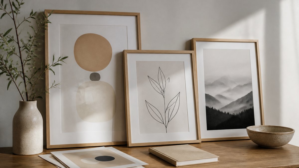
These prints excel in gallery walls because they anchor a composition without demanding individual attention. A single geometric print may feel incomplete, but three or four arranged thoughtfully create rhythm and depth. Keep the palette unified and the visual weight balanced.
Geometric art also scales well. Unlike photography or detailed illustration, geometric designs look equally strong at 8 inches or 48 inches. This flexibility makes it easier to fit printable geometric art into whatever wall space you actually have.
Botanical and Nature-Inspired Artwork
Nature-inspired minimalist art includes botanical elements but strips away unnecessary detail. A single eucalyptus branch in watercolor, a monochrome fern frond, or pressed botanical specimens in outline form all fit this category.
Printful's 2026 trend analysis identifies biophilic and natural-texture wall art as a leading aesthetic direction, which explains why botanical prints have remained consistently popular. They bring organic calm to a space without the visual clutter of realistic nature photography.
For minimalist rooms, botanical art works best when rendered in limited color palettes: greens and whites, blacks and grays, or a single warm tone like terracotta against a neutral background. Avoid botanical prints with realistic shading or heavy detail; those cross into maximalism territory.
Typography and Text-Based Prints
Words carry weight in minimalist design. A single powerful word or short quote in elegant typography becomes both art and affirmation, with message and visual form working together.
The most effective text prints use generous whitespace, thoughtful fonts, and restrained sizing. A quote filling an entire wall is maximalism; one occupying the center third of a large print, surrounded by breathing room, is minimalism.
Text prints also allow personalization: choose quotes that resonate with your values or goals, making the piece feel genuinely yours rather than mass-produced.
Color Palettes That Define Minimalist Aesthetics
Minimalist color palettes are built on constraint: a limited selection where each color does meaningful work.
Most minimalist spaces are built on neutrals: whites, creams, beiges, and soft grays. These aren't boring, they're intentional, and within neutrals there's significant range, from warm cream to cool white to greige.
Accent colors are chosen deliberately. Terracotta, sage green, warm charcoal, and muted blues complement neutrals without competing. One accent color used consistently across prints creates coherence; two can work if they feel intentional.
Muted tones perform better than saturated ones in minimalist spaces. A muted terracotta reads as calm and intentional; a bright orange reads as energetic and potentially chaotic. Mixtiles' 2026 style guide highlights warm minimalism as a trending approach, which emphasizes softer, more nuanced color choices over stark contrast.
The most sophisticated minimalist color palettes often use monochrome within a single piece (black on white, charcoal on cream) while introducing subtle accent colors across the gallery as a whole. This creates visual interest without visual noise.
Minimalist Gallery Wall Ideas and Layout Strategies
A minimalist gallery wall requires different thinking than a maximalist one. The goal isn't to fill space but to create intentional composition with breathing room.
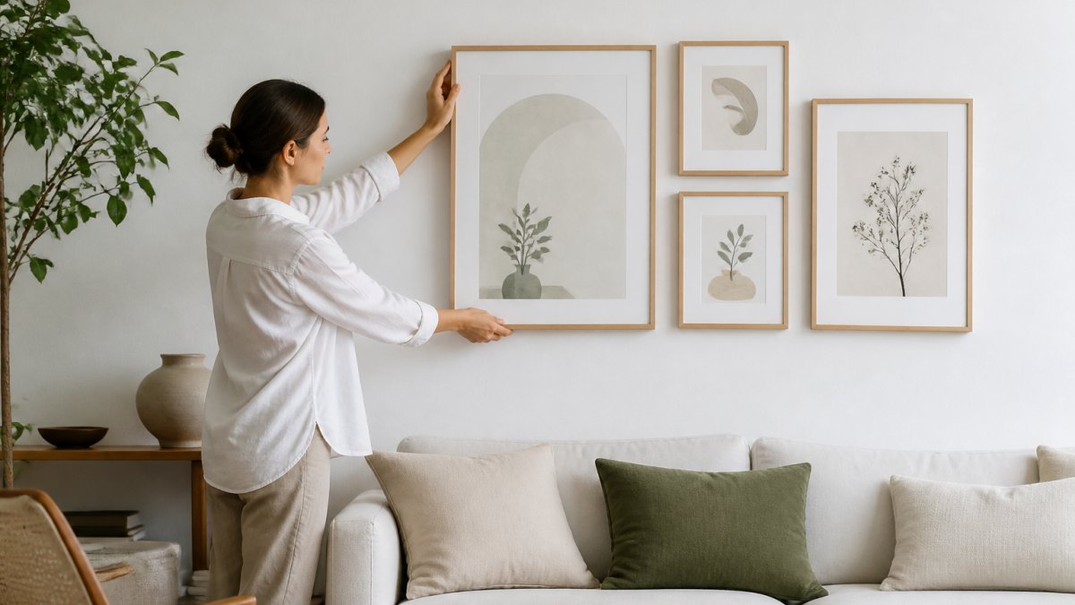
Start by defining your grid: either a strict grid layout (equal spacing, equal-sized frames) or a carefully asymmetrical layout with deliberately offset pieces.
Spacing matters more in minimalist design than any other style.
Consistency in framing is essential. All frames should share the same finish (matte black, natural wood, white) and ideally the same depth. Mixing thin metal, thick wood, and frameless pieces introduces visual chaos.
Start with 3-5 pieces rather than filling an entire wall; odd numbers feel more intentional. Arrange them on the floor first, then hang.
Minimalist Art Print Sizes and Room Placement
Sizing Guidelines by Room Type
Bedrooms benefit from medium-scale art: 16x20, 18x24, or 20x28 inches. These feel substantial without overwhelming the room's intimacy.
Living rooms can accommodate larger prints: 24x36 or even 30x40 inches, depending on wall space. Larger pieces anchor a seating area. For a gallery wall, mix sizes: one 24x36 anchor with several 11x14 or 16x20 supporting pieces.
Entryways work best with medium-to-large single prints or small galleries of 2-3 pieces. Guests form first impressions here, so a 20x28 or 24x36 print can set the tone for your entire home.
Home offices need prints that inspire without distracting. A 16x20 or 18x24 piece positioned where you'll see it during breaks works better than something filling your field of vision. Place art at eye level when seated at your desk.
Spacing and Wall Composition
The standard rule for single prints is to center them at eye level, roughly 57-60 inches from floor to center of frame. For gallery walls the rule is more flexible, but the visual center should still sit around eye level.
When spacing multiple frames, measure between frame edges, not centers. Minimalist spacing is typically 2-4 inches; larger feels deliberate, tighter (under 2 inches) makes pieces feel grouped rather than individually displayed.
Vertical alignment matters. A perfectly straight horizontal line reads formal; staggering heights slightly creates interest while maintaining calm, as long as the stagger feels intentional. Measure and mark before hanging.
Wall color affects how art reads: on white walls it floats, on warm cream it integrates softly, on a darker accent wall it becomes a focal point. Choose wall color first, then art that complements rather than competes.
How to Frame Printable Art for a Polished Look
Framing transforms a print from a sheet of paper into a finished piece, determining whether your printable art reads as intentional or temporary.
For minimalist spaces, keep frame selection restrained. Matte black works almost anywhere; natural wood (oak, walnut, light pine) suits warm minimalism; white or off-white suits bright, airy spaces.
A single mat in white, cream, or a neutral tone gives breathing room between print and frame. Colored mats can work if pulled from your accent palette but are optional.
Glass looks more premium and doesn't yellow, but it's heavier and more fragile. Acrylic is lighter and safer but can scratch and haze over years.
Frame thickness matters visually: thin frames (under 1 inch) feel contemporary and minimal, thick frames (2+ inches) feel traditional or gallery-like. Choose based on your overall aesthetic.
Finding and Preparing Your Printable Files
File Formats and Resolution Requirements
Printable art files typically come in PDF or JPG. PDFs preserve formatting and colors more reliably across printers; JPGs offer more flexibility for editing or resizing. Request both formats if available.
Resolution determines print quality. 300 DPI is standard up to 11x14 inches and remains the baseline for larger prints, though some printers accept 150 DPI for very large formats if the source file is high-quality. Below 150 DPI, pixelation shows at standard viewing distance.
File size matters for storage and printing. A high-resolution 24x36 file might be 50-100 MB, which is normal. Most modern print services handle files up to 500 MB without issue.
Before printing, verify color mode: RGB for screen viewing or home printing, CMYK for professional printing. If using a print service, confirm they want CMYK so colors match your screen preview.
Licensing and Usage Rights
When you buy printable art, you're typically buying a license to print for personal use, not ownership. You can print for yourself and your home; you cannot sell prints, use them commercially, or redistribute the file.
Some sellers offer commercial licenses for an additional fee, allowing you to print and sell the art or use it in business. If buying from any seller, confirm license terms before purchasing; they should be clearly stated at checkout.
Attribution requirements vary: some creators ask for credit when you share photos on social media, others don't. Check the terms; respecting attribution is ethical and maintains the creator's reputation.
Digital files don't expire but can become corrupted. Back up important files to cloud storage or external drives; if you lose access and need to reprint, you may have to repurchase.
Printing and Framing Cost Considerations
Printing costs vary by size, paper quality, and whether you print at home or professionally.
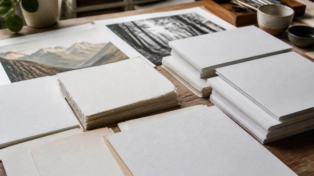
Paper affects cost and appearance.
Framing is the largest cost variable. DIY framing (frame, mat, and glass separately) runs $20-60 for a small print to $100-200 for a large one. Professional framing charges $50-300+ depending on quality and size.
A finished 24x36 minimalist print typically costs $40-150 DIY (print plus retailer frame) to $150-400+ with professional printing and custom framing. Smaller prints (11x14 or 16x20) cost proportionally less.
The key consideration: printable art remains far more economical than original art or high-end gallery prints while offering complete customization. You're paying for design and materials, not retail markup.
Creating a minimalist space that feels intentional rather than sparse requires thoughtful art selection. Printable art gives you control over every element, from size to frame to placement.
Frequently Asked Questions
What colors work best for minimalist wall art?
Neutral palettes dominate minimalist decor: whites, blacks, grays, beiges, and soft terracotta tones. Muted colors like dusty sage, warm taupe, and soft ochre also work well. The goal is to avoid visual clutter, stick to 2-3 colors maximum in your printable art selections. Monochromatic or limited-color artwork maintains the calm, uncluttered aesthetic that defines minimalist spaces.
What size art print works best above a sofa?
For a sofa, a single large print (36x48 inches or 91x122 cm) or a pair of medium prints (16x20 inches or 41x51 cm each) create visual balance without overwhelming the space. A good rule: the artwork should cover about 50-75% of the wall width above the sofa. Larger prints feel more intentional in minimalist design, while multiple smaller pieces can work if arranged in a tight, organized grid.
How do you create a minimalist gallery wall?
Start with a clear layout: sketch your arrangement on paper or use painter's tape on the wall first. Space frames 2-3 inches (5-8 cm) apart for a connected look, or leave wider gaps for a more dispersed feel. Stick to 3-5 pieces maximum to avoid clutter. Use matching or complementary frames in black, white, or natural wood. Keep artwork thematically linked, all line art, all botanical, or all abstract, to maintain visual cohesion.
Should minimalist wall art be framed?
Framing elevates printable art and protects it from damage, dust, and fading. Simple frames in black, white, or natural wood align with minimalist aesthetics. Frameless options like floating frames or canvas prints work too, but traditional frames provide a polished, intentional look. For printable art, framing also prevents curling and extends the lifespan of the print, making it a worthwhile investment for pieces you plan to display long-term.